
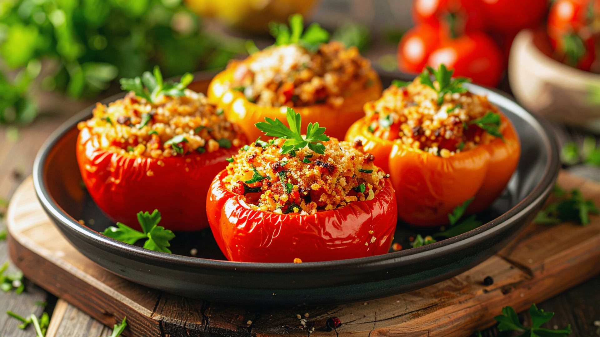
Plating food like a professional at home is achievable with a few simple techniques. The key is to focus on balance, colour contrast, and the thoughtful placement of each element on the plate. These factors transform a basic meal into a visually appealing dish.
Understanding the importance of using the right plate size and keeping portions neat will help create an inviting presentation. Adding small garnishes or sauces strategically can elevate the overall look without overwhelming the food.
With practice, these skills become second nature, turning everyday meals into impressive experiences. Anyone can develop the eye to plate food thoughtfully, enhancing both enjoyment and presentation.
Understanding the Fundamentals of Food Plating
Successful food plating relies on combining visual appeal with a thoughtful arrangement that enhances the dining experience. Key elements include the scientific approach to food presentation, the role of colour and texture, and achieving balance through proportion and symmetry.
The Science Behind Food Presentation
Food plating uses principles from psychology and sensory science to influence perception. People eat first with their eyes, so the arrangement should direct attention towards the main components of the dish.
Spacing on the plate is crucial; too crowded looks messy, too sparse feels incomplete. Negative space highlights the food and prevents overwhelming the diner. The position of elements guides the eye along a deliberate path, encouraging a natural flow from one bite to the next.
Temperature and freshness also impact presentation, as condensation or wilting can disrupt the desired aesthetic. Proper plating considers these factors to maintain an appetising appearance throughout the meal.
Importance of Colour, Texture, and Shape
Colour contrast makes dishes vibrant and eye-catching. Using complementary or contrasting colours can create focal points and enhance appetite appeal. For example, a bright vegetable alongside a creamier, neutral protein adds visual energy.
Texture variation adds interest and depth to the plate. Mixing crunchy, smooth, and soft components provides sensory balance and prevents monotony. Shapes affect perceived portion sizes and can alter the dish’s tone—rounded edges often feel softer, while angular shapes add a modern touch.
By combining these elements intentionally, culinary presentation elevates even simple meals into memorable dining experiences.
Balancing Proportion and Symmetry
Proportion refers to the quantity and size of each element on the plate relative to one another and the plate’s size. Proper portioning avoids overcrowding and makes the dish look neat.
Symmetry creates harmony and order, helping the eye rest comfortably on the plate. However, perfect symmetry can feel static or rigid, so a slight asymmetry often adds natural appeal.
Chefs often use the “rule of thirds” by dividing the plate visually to place elements dynamically, but balanced. This technique enhances focus on the dish’s highlights while maintaining cohesive presentation.
Selecting the Ideal Plate
The choice of plate affects the presentation and perception of the dish. Selecting a plate involves considering size, shape, and colour to complement the food. The plate should highlight the dish without overwhelming it.
Choosing the Right Plate for Each Dish
The plate size must match the portion to create balance. A too-large plate can make the food seem sparse, while a small plate may cause overcrowding. Round plates are versatile for most dishes, but square or rectangular plates suit modern, minimalist plating styles.
The plate’s edge can frame the food or draw attention away. Deep plates work best for soups or saucy dishes, while flat plates showcase solid foods. Material matters too: porcelain and ceramic provide a smooth surface and solid feel, preferred for professional presentation.
The Impact of White Plates and Neutral Backgrounds
White plates offer a neutral canvas that makes colours in the food stand out. They avoid colour clashes and allow the viewer to focus on the dish’s texture and detail. White plates create contrast, making vibrant ingredients look fresher and more appealing.
Neutral backgrounds reduce distractions and maintain attention on the food itself. They are flexible for all types of cuisine and enhance the visual sharpness of the plating. Using white plates consistently can help achieve a clean, professional look at home.
Mastering Professional Plating Techniques at Home
Achieving professional plating requires attention to structure, colour, and arrangement. Combining these elements prioritises both aesthetics and functionality, enhancing the dining experience.
Creating Height and Layering Elements
Height creates visual interest by adding dimension. To master this, stack ingredients thoughtfully rather than spreading them flat. For example, placing a protein atop a bed of vegetables or grains adds elevation.
Layering should balance textures and flavours. Use sturdy bases like mashed potatoes or polenta to support softer elements. Avoid overcrowding, so each layer remains distinct and stable.
Height also guides the diner’s eye, leading them through the dish. Use small towers, leaning components, or skewers to add vertical appeal without sacrificing stability or practicality.
Using Colour Contrast for Visual Appeal
Colour contrast makes the dish immediately attractive. Select ingredients with differing hues, such as bright green herbs against pale proteins or vibrant reds beside creamy sauces.
A simple method is to use a white or neutral plate to highlight colours effectively. Avoid overcrowding colours, as this can create confusion rather than impact.
Complementary colours (blue/orange, red/green) strengthen visual appeal. Small garnishes like microgreens or edible flowers contribute to this without overwhelming the plate.
Arranging Components for Maximum Impact
Placement on the plate guides the diner’s interaction with the food. Generally, heavier items go on the lower left for balance, with lighter or more colourful items placed opposite.
Create clear focal points by grouping ingredients deliberately rather than scattering them randomly. Negative space is important too; it gives the eye room to rest.
Keep utensils and sauces within easy reach by positioning components thoughtfully. Circular, diagonal, or linear arrangements can each serve different meal types and presentation goals.
Incorporating Texture for Depth
Texture variation makes the dish more engaging. Combining crisp, creamy, and tender elements results in complexity and interest.
Use crunchy garnishes like toasted nuts or fried shallots alongside soft purées or grilled proteins. This contrast emphasises each component’s qualities.
Textures can be layered both visually and physically. For instance, a crisp tuile resting on a smooth mousse enhances depth and invites tactile interaction.
Finishing Touches: Garnishes and Presentation Details
The final presentation of a dish relies on careful choices of garnishes, sauce application, and thoughtful arrangement. These elements enhance colour, texture, and balance without overwhelming the plate.
Adding Fresh Herbs and Edible Flowers
Fresh herbs such as parsley, chives, or coriander add vibrancy and complement flavours. They should be added just before serving to maintain crispness and colour.
Edible flowers like nasturtiums or pansies bring visual interest and subtle flavour. Use them sparingly and ensure they are pesticide-free.
Both herbs and flowers can be used whole or chopped finely for contrast. They work well near main components or around the edge of the plate.
Garnishing with Sauces and Toppings
Sauces should be applied with precision using squeeze bottles or spoons to create dots, lines, or swooshes. This controls portion size and adds neat visual appeal.
Toppings such as toasted nuts, seeds, or crispy shallots introduce texture and enhance taste. Sprinkle these strategically on or around the dish, avoiding clutter.
Balance is key; an excess of garnishes can distract. Each element should add to the dish’s flavour profile or presentation.
Strategic Placement for Final Appeal
Placing garnishes where the eye naturally rests creates intuition in the presentation. Position flowers or herb sprigs near the main item, not randomly scattered.
Leave some negative space on the plate to prevent overcrowding. This makes the garnishes stand out and frames the food effectively.
Layering elements by height or overlap adds depth. Small clusters can draw attention without disrupting the dish’s symmetry.